Affordable Housing Hub
Overview
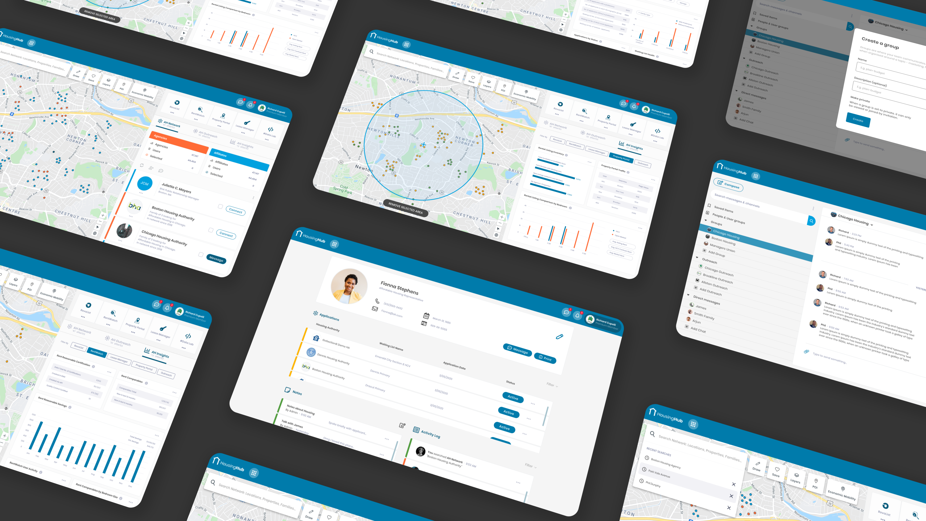
Affordable Housing (AH) is a platform that is establishing a national hub and creating trusted relationships with government agencies, landlords, and tenants to offer and secure affordable housing. As a designer at Design Axl, I worked on creating the entire UX flow, wireframes, UI, and visual design for their dashboard. This new dashboard is the new home for all eligibility-based programs and affordable housing options, including the Section 8 Program, that the company provides under one roof.
My role
- Overseeing the entire user experience design of the AH Hub
- Brainstorming features for product roadmap
- Developed low-fidelity wireframes to visualize the dashboard's structure and user interactions
- Visual language design and prototyping
- Pitching designs and explorations to stakeholders

Challenge
- The main challenge lies in developing a unified dashboard that seamlessly incorporates all of AffordableHousing's products. This dashboard must be scalable to accommodate the continuously expanding list of products and the regular introduction of new features.
- Designing the dashboard to cater to the needs of all three primary user types in an affordable housing scenario - landlords, agencies, and families - presents a significant challenge. Each user group has unique requirements and preferences that need to be addressed while ensuring a cohesive and user-friendly experience for all.
- One of the primary objectives is to effectively market the features and services provided by AffordableHousing through the dashboard. The challenge is to present these offerings in a compelling way that entices clients to consider paying for premium services and highlights the platform's value proposition.
Proposed Solution
- Unified Design Language: We established a cohesive and unified design language for the dashboard, ensuring a consistent user experience across all Saas products. By incorporating the Affordable Housing platform's branding elements, we maintained brand recognition while preserving the individuality of each service.
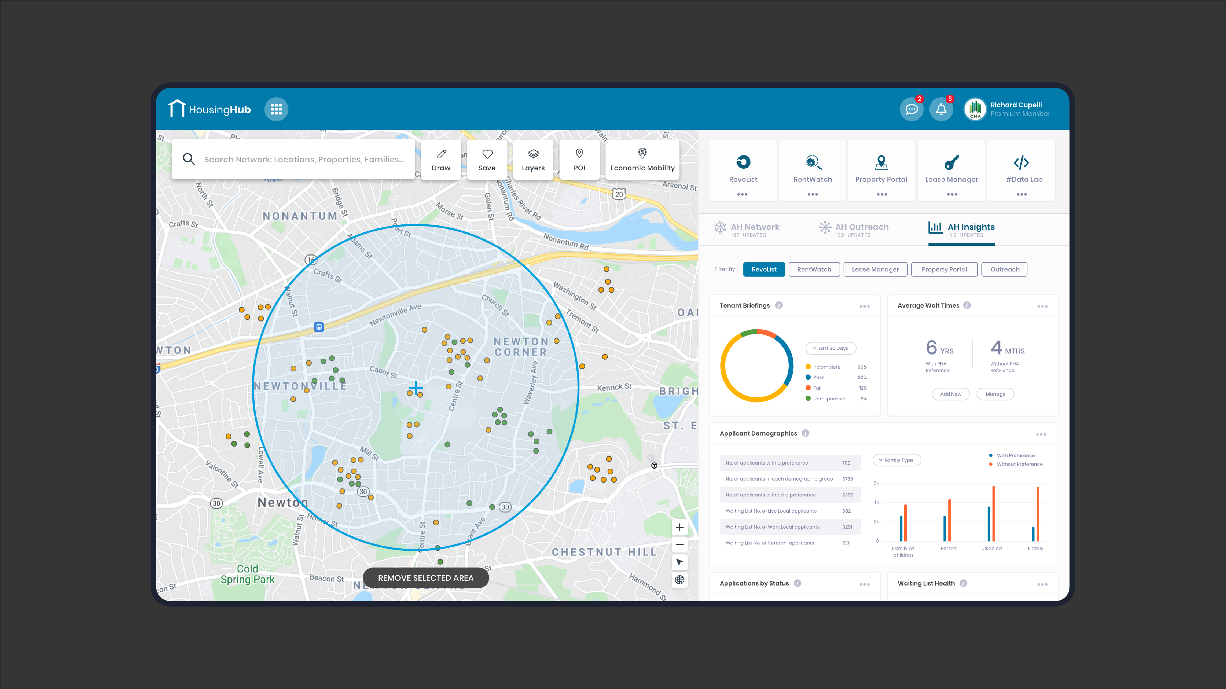
- Gated Dashboard Experience: To encourage users to opt for premium membership, we introduced a gated dashboard experience. By offering exclusive features like AH Insights, filtered search options, and messaging functionalities, we incentivized users to upgrade their membership for enhanced benefits and access to valuable resources.
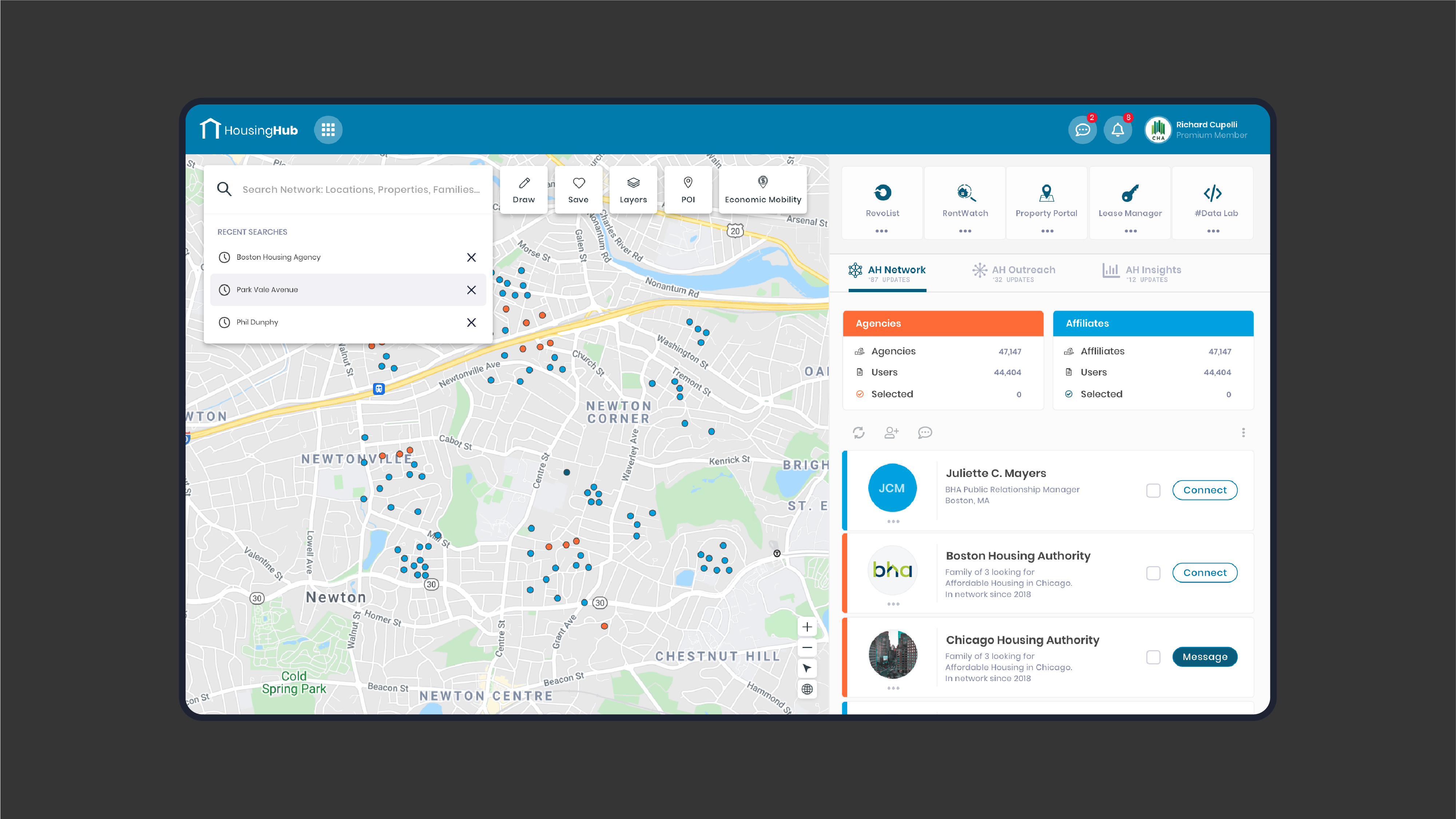
- Intelligent Search and Interactive Maps: To optimize the user's search experience, we implemented an intelligent search feature. This allows tenants to easily find suitable housing options based on their specific preferences, such as location, price range, and property type. Furthermore, the integration of interactive maps enables users to visualize available properties, simplifying the process of comparing and selecting the ideal location.
User Personas
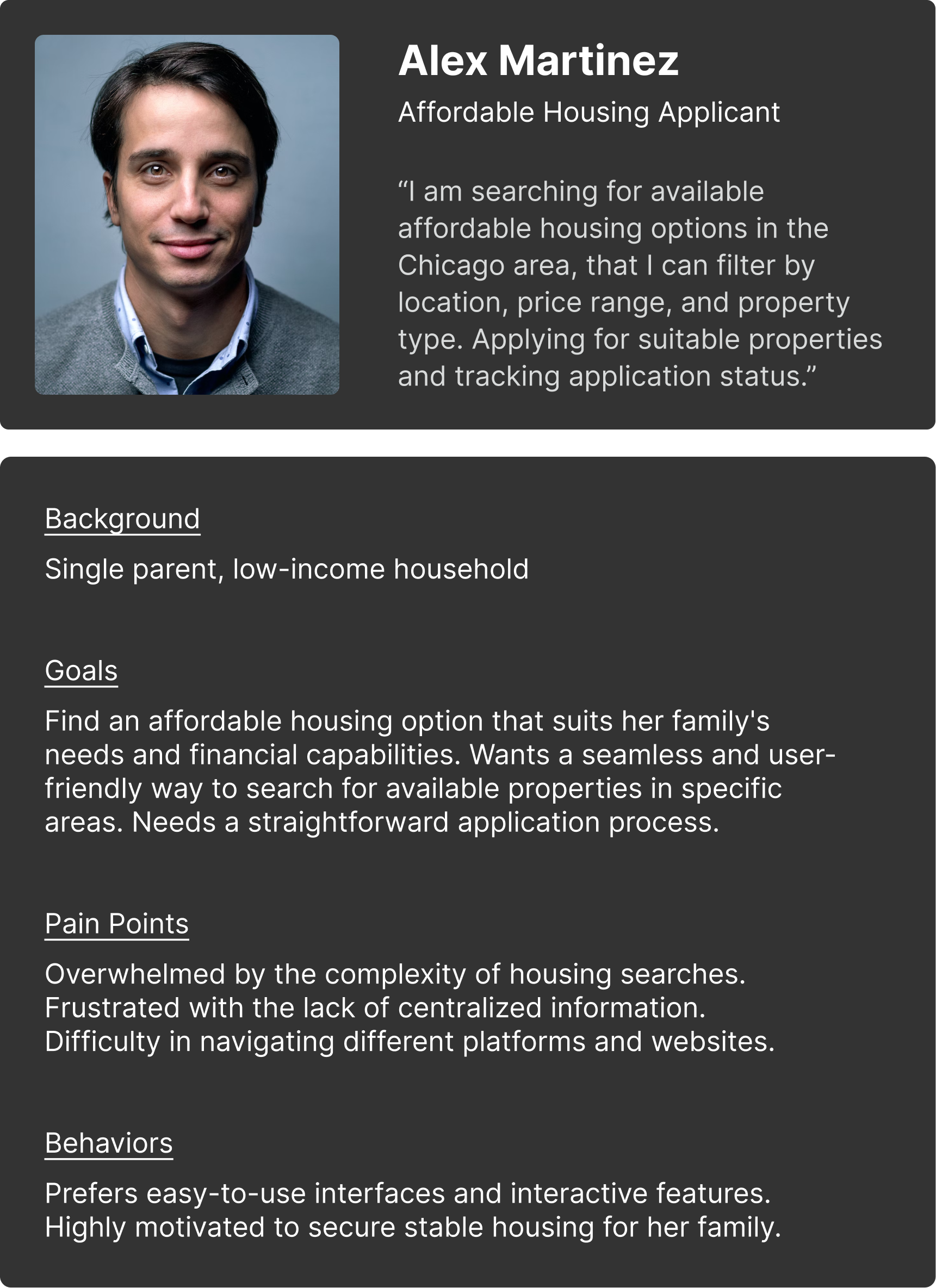
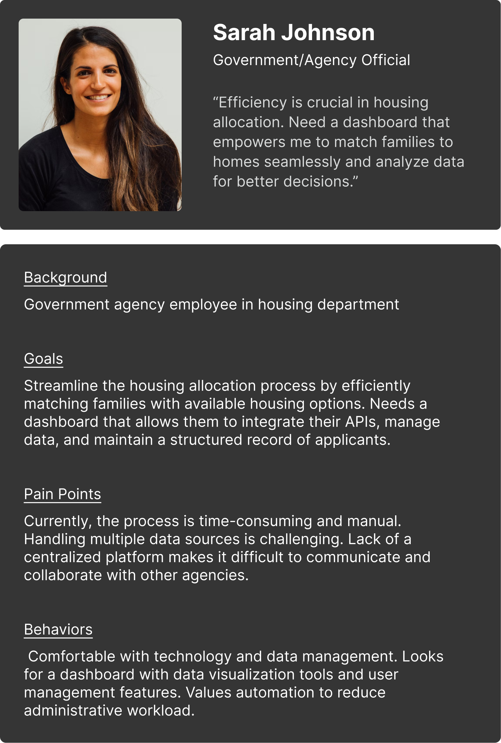
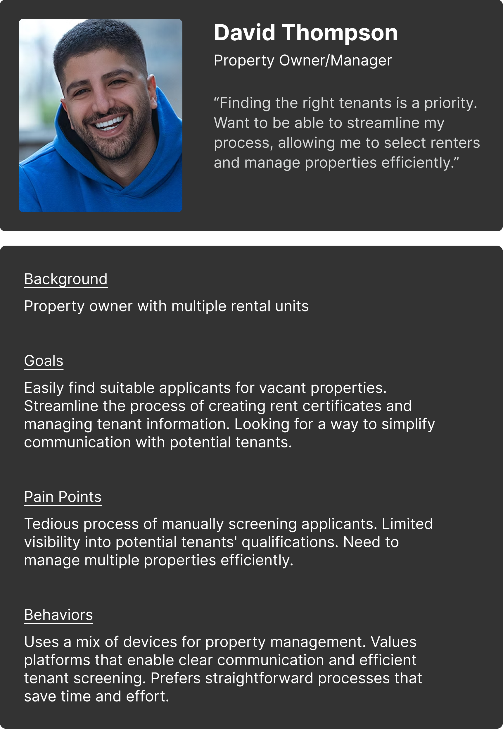
In the pursuit of a user-focused dashboard for Affordable Housing, we honed in on three pivotal personas: The Applicant, The Government/Agency Official, and The Property Owner/Manager. These personas emerged as guiding lights, illuminating the diverse needs and preferences of users. By visualizing their unique journeys, I gleaned insights into pain points and motivations that directly influenced design choices, prioritization, and user pathways.
These personas not only informed design but also bridged communication gaps among stakeholders. As the project unfolded, they guided us in creating solutions aligned with users' expectations.
Building a Framework for Design
The site map was meticulously crafted based on insights derived from surveys, interviews, and invaluable client input. This collaborative effort unveiled several crucial findings:
The site map was meticulously crafted based on insights derived from surveys, interviews, and invaluable client input. This collaborative effort unveiled several crucial findings:
- User Demand for Interactive Maps: The consensus among users was the high demand for an interactive map feature. This feature emerged as a solution to streamline their tasks. Agencies expressed their interest in the ability to seamlessly integrate their APIs onto the map. Families, on the other hand, emphasized the importance of filtering options to identify properties according to specific areas. Moreover, property owners sought a way to efficiently locate potential applicants.
- User-Centric Approach for Families and Applicants: Families and applicants expressed a clear desire for a convenient and comprehensive solution. They identified the need for a singular platform that simplifies the process of locating affordable housing. This insight was a driving force in shaping the user experience to ensure a seamless and efficient journey for these users.
- Data Analysis for Governments and Agencies: Recognizing the need for comprehensive data analysis, government entities and agencies voiced their interest in harnessing the data collected from all registered applicants. This requirement underscored the importance of developing functionalities that empower them to analyze this data effectively.

Identifying Design Patterns Through Rapid Sketching
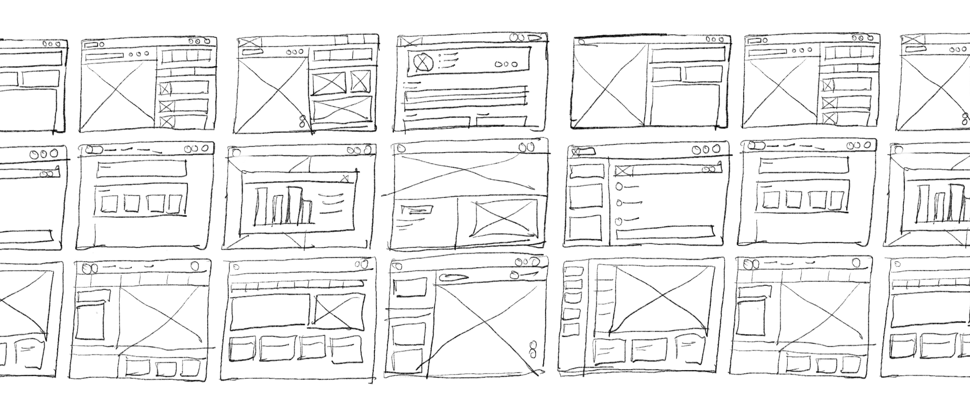
Rapid sketching and low-fidelity wireframes played a pivotal role in my process by swiftly translating abstract ideas into tangible visual concepts. These tools allowed for quick experimentation, enabling me to iterate and refine design ideas efficiently while maintaining a focus on essential user interactions and layouts.
Rapid sketching and low-fidelity wireframes played a pivotal role in my process by swiftly translating abstract ideas into tangible visual concepts. These tools allowed for quick experimentation, enabling me to iterate and refine design ideas efficiently while maintaining a focus on essential user interactions and layouts.
Visual Design
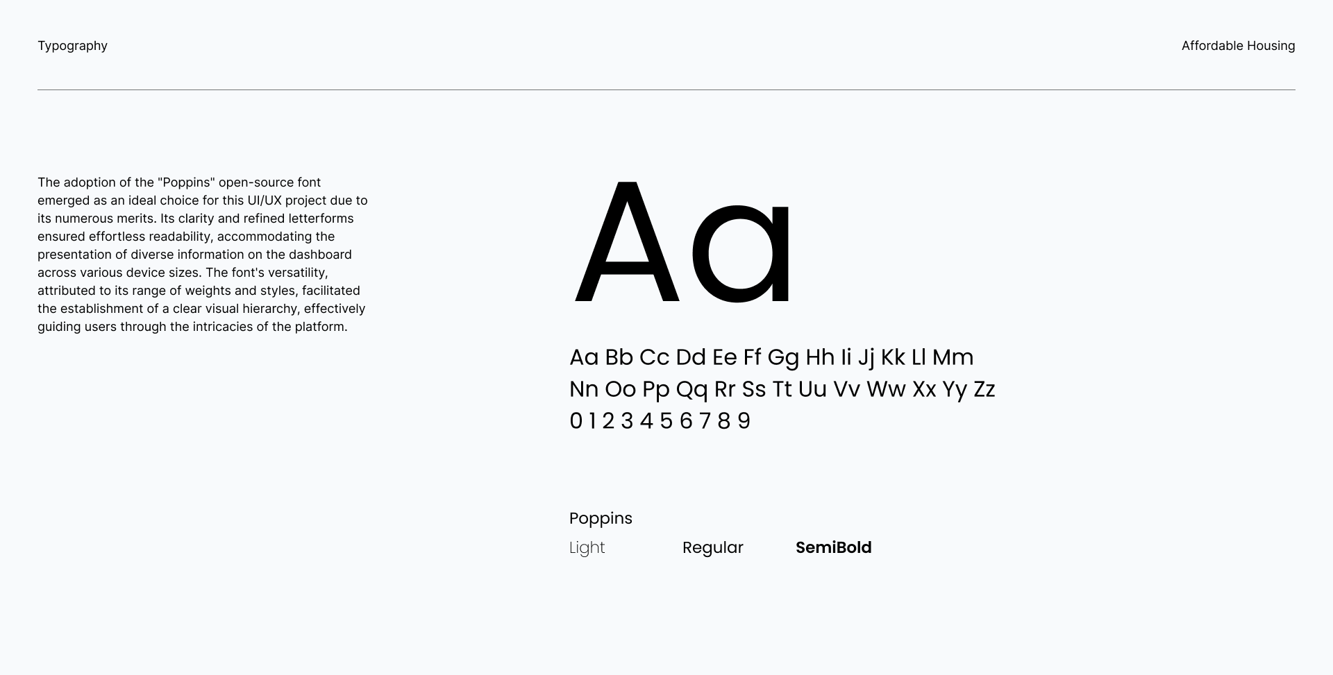
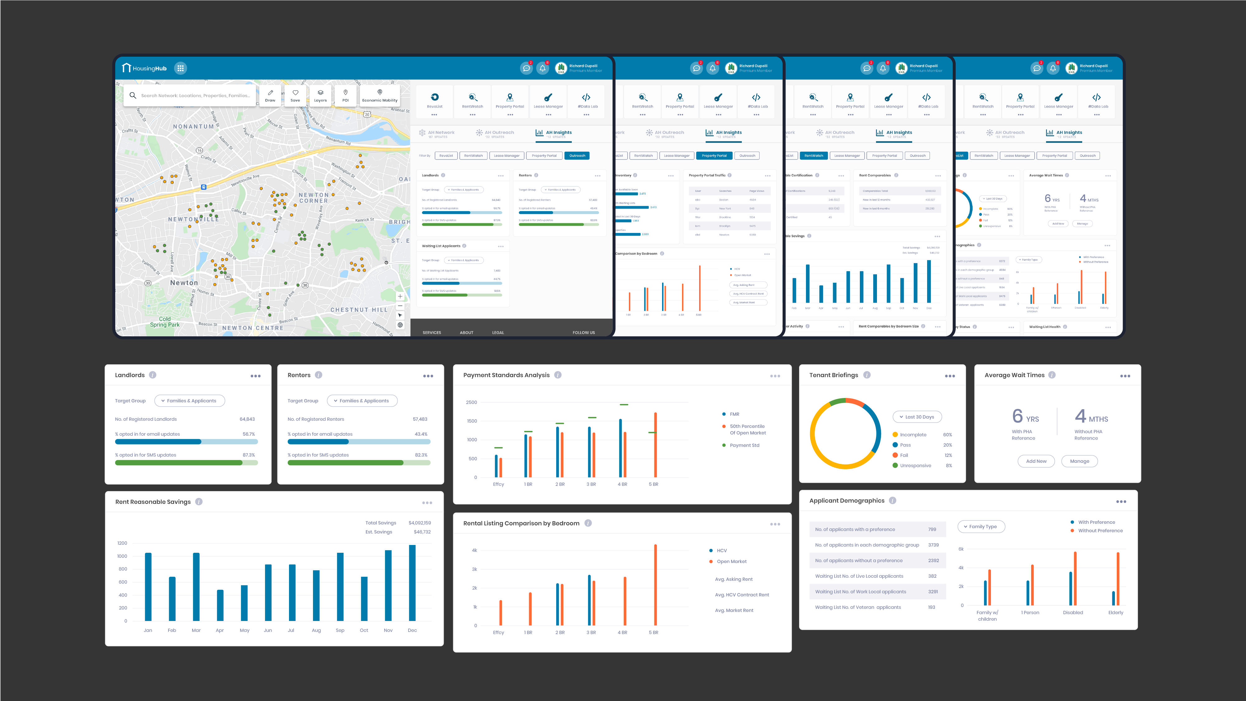
I embraced the opportunity to spearhead the creation of a distinct visual design language for Affordable Housing's dashboard, a task that extended to forging a comprehensive and adaptable visual system. This entailed defining an optimal grid structure to ensure content alignment and consistency, while judiciously selecting typography that harmonized legibility with the platform's identity. I meticulously curated a color palette that resonated with the ethos of affordable housing while maintaining visual balance.
Moreover, my role encompassed designing a range of integral UI components, including buttons that provided clear calls to action, search bars optimized for effortless navigation, and dynamic infographics that conveyed data insights succinctly. UI cards were thoughtfully crafted to organize content and facilitate visual hierarchy.


Lessons learned
- Modularity and Consistency Foster Usability: By structuring the dashboard with well-organized modules and consistent design patterns, I ensured that users could navigate seamlessly and predictably. This approach helped to create a structure that was scalable to incorporate new features in the future also.
- Data-Driven Design Enhances Value: Integrating real-time data insights, as seen in the RentWatch integration, empowered agencies and landlords with informed decision-making capabilities. Designing around actionable data proved crucial for creating a truly valuable tool.
- User-Centricity is Paramount: This project underscored the necessity of putting users at the forefront of every design decision. By crafting personas and constantly referring to them, I ensured that the dashboard resonated with users' needs, resulting in a more engaging and intuitive experience.