Verizon Smartwatch Userflow
Overview
The rise in consumer demand for smartwatches prompted Verizon Prepaid to explore the release of smartwatch plans for its user base. To support this expansion of Verizon Prepaid offerings, our team was tasked with defining and creating new activation and sales pathways across various Verizon platforms. These platforms included Verizon's customer-facing landing pages (.COM), My Verizon Online Desktop (MVOD) interface, My Verizon Online Mobile (MVOM) interface, and the My Verizon App (MVA). Our primary objective was to identify and address the impact on existing user flows due to the introduction of smartwatch devices and plans. Additionally, we needed to design new user flows within these platforms to enable Verizon customers to seamlessly purchase or integrate their own smartwatches with Verizon's prepaid plans.
My role
- Lead visual design for the entire project
- Prototyping userflows and executing micro-animations
- Assisting in audit, user research and wireframing
- Pitching designs and explorations to stakeholders
- Designing the marketing website and promo banners
Design Team (AKQA)
Arjun Kumar (me) – Sr. Product Designer + Motion Lead
Courtney Schiffres – Associate Copy Director
Emily Pan – Sr. UX Designer
Eva Cheung – Sr. UX Designer
Hoon Oh – Associate UX Director
Olivia Fitzmorris – Copywriter
Arjun Kumar (me) – Sr. Product Designer + Motion Lead
Courtney Schiffres – Associate Copy Director
Emily Pan – Sr. UX Designer
Eva Cheung – Sr. UX Designer
Hoon Oh – Associate UX Director
Olivia Fitzmorris – Copywriter

Challenge
- Complex User Ecosystem: Verizon's user ecosystem is diverse, encompassing different user types, platforms, loyalty and multiline discounts, compatibility requirements, and various entry points. This complexity necessitated careful consideration of numerous use cases and edge cases during the design process.
- Marketing Smartwatch Plans: It was imperative not only to cater to Verizon's existing customer base but also to effectively market smartwatch plans to potential customers as the premier choice for their smartwatches.
- Resource Limitations: We encountered limitations in terms of development resources and Jira user stories, which impacted our ability to create new design components for our screens. We often had to rely on existing components, requiring creative solutions to maintain design consistency.
Proposed Solution
- To efficiently manage the project's complexity and resource constraints, we implemented a phased approach. We broke down the project into distinct phases based on the impacted platforms and user flows.
- To effectively market smartwatch plans, we adopted a personalized marketing strategy. For existing customers, we emphasized the seamless integration of smartwatch plans into their existing Verizon ecosystem. For potential customers, we highlighted the unique features and advantages of Verizon's smartwatch plans.
- By maximizing the reuse of existing UI components, we reduced the need for custom development and maintained a cohesive user interface.
Phase 1
The first phase involved modfiying the Bring Your Own Device (BYOD) flow through the My Verizon app and Original Equipment Manufacturer (OEM) flow through the native watch app. Our goal was to create flows to allow users to add a smartwatch plan on to their smarwatches. Hence, the paths that we worked on were:
- iOS Apple Watch Activation Path: Adding a Verizon smartwatch line when a user is activating their smartwatch using Apple’s native Watch app.
- Android watch Activation Path: Adding a Verizon smartwatch line when a user is activating their smartwatch using Google’s native Watch app.
- My Verizon App Activation Path: Adding a smartwatch line to user’s existing smartwatch through the My Verizon App.
User Personas
In our commitment to a user-centric experience, we identified four distinct user personas seeking to activate a new Verizon smartwatch line, categorized by their choice of Android or iOS operating systems. These personas encompassed Android enthusiasts, cross-platform explorers, Apple ecosystem devotees, and selective iOS users. This segmentation enabled us to tailor user flows to their unique needs, recognizing that activation complexities hinged not only on OS selection but also OS versions and number selection methods. By prioritizing features and considerations for each persona, we ensured a seamless and satisfying activation process, accommodating the diverse preferences of Verizon Prepaid customers across different devices and ecosystems.
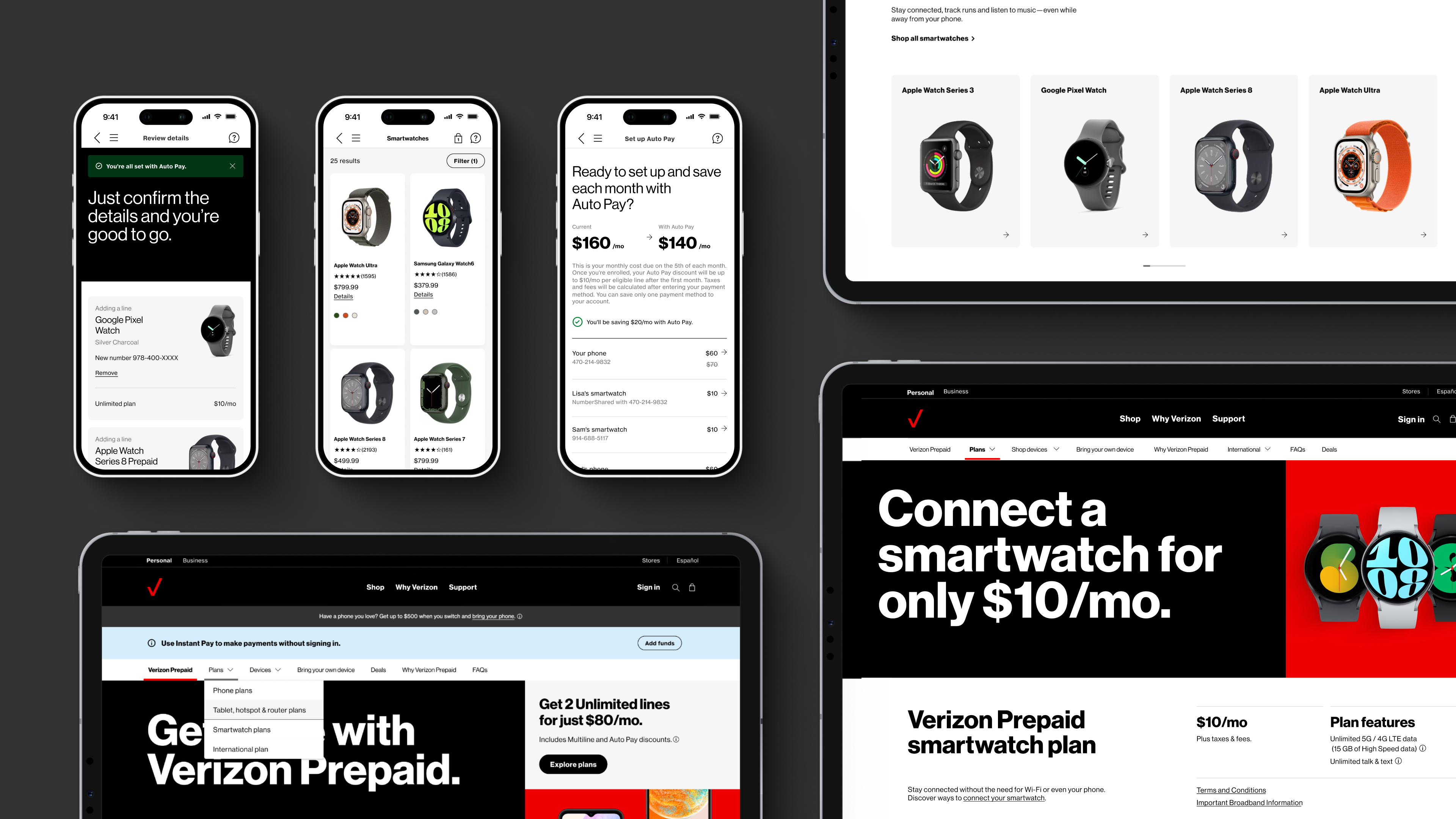
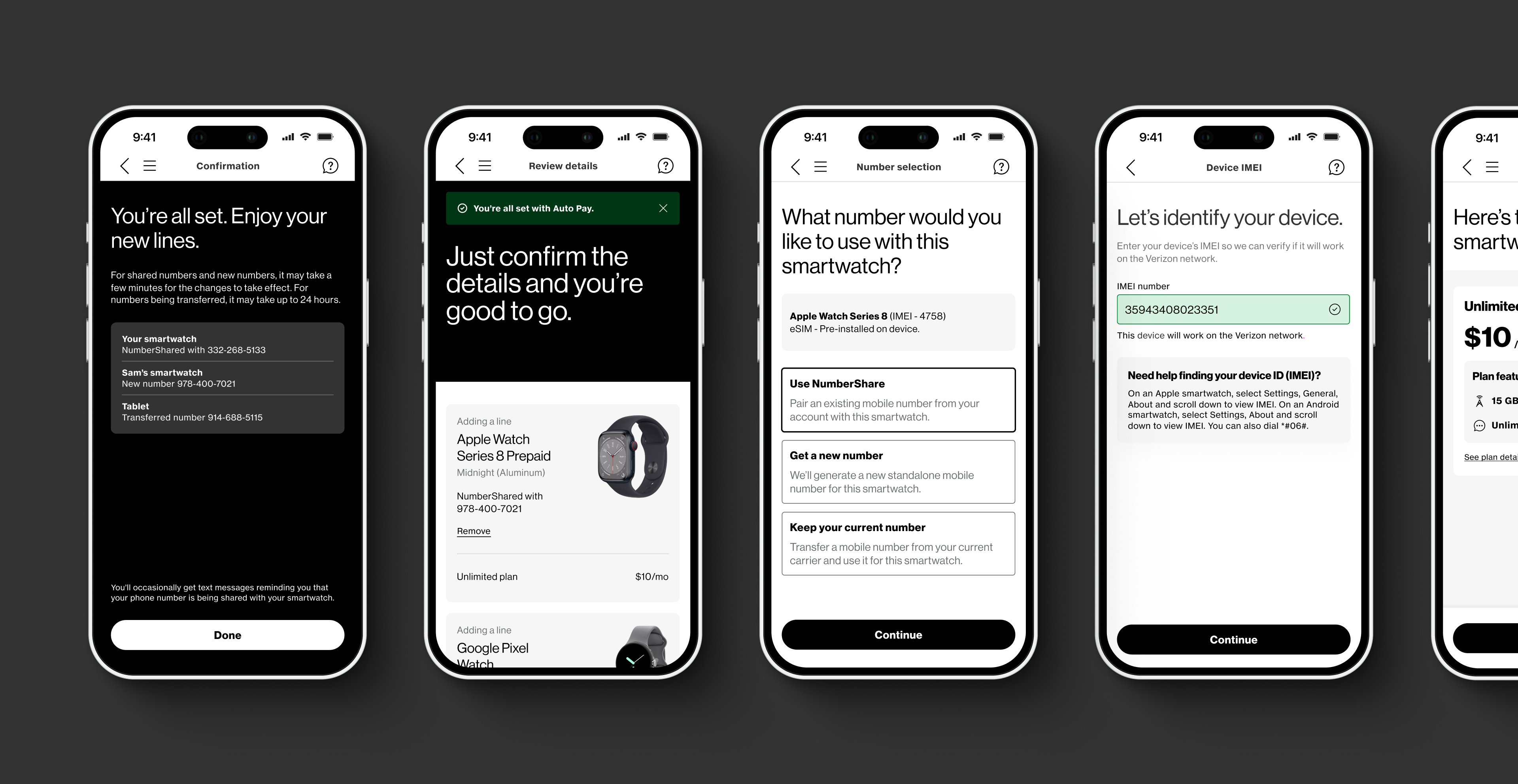
Userflow (Phase 1)
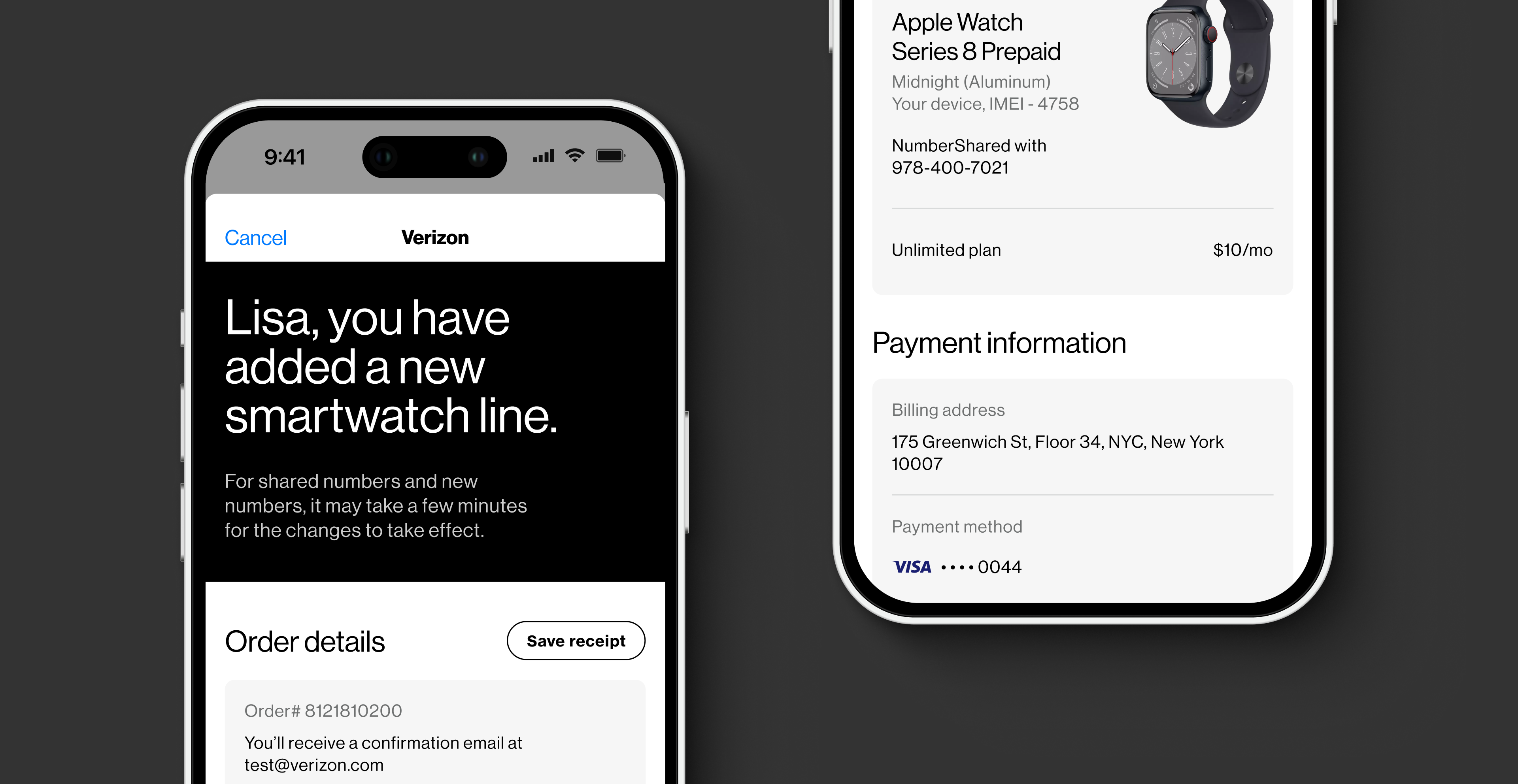
This is the birds-eye-view of the entire user flow for BYOD Add a line (AAL) Activation flow. This user flow was meticulously designed to simplify and streamline the BYOD AAL Activation process, guiding users through each step seamlessly while accommodating the complexities of the Verizon ecosystem.


This is the birds-eye-view of the entire user flow for OEM Add/Replace Activation flow. This user flow was designed to guide the users to add their Apple/Android Watch and add a watch line through the native Watch App. We were able to leverage a lot of the same screens from the BYOD flow thus making it easier to consolidate the user stories.

Phase 2
The second phase of our project delved into enhancing the sales and shopping experiences across Verizon's platforms, including the landing pages and the My Verizon App. To ensure a focused and effective approach, we subdivided this phase into two key components:
- Verizon Landing Pages: We undertook a comprehensive overhaul of the Verizon Prepaid landing pages, creating a new landing page for Verizon smartwatch plans and strategically promoting it on other pages.
- My Verizon App Shop Activation Path: Within the My Verizon App, we designed a new shop activation path, providing users with a seamless process to purchase a new smartwatch and effortlessly add a new smartwatch line.
Site Navigation
To enhance site navigation on the Verizon Prepaid landing pages, our initial step involved crafting a comprehensive site map. Armed with click rate dataprovided by Verizon, we strategically identified optimal placements for "Smartwatch plan" and "Smartwatches" within the navigation. Throughout the restructuring process, our primary objective was to ensure visibility for crucial landing pages while facilitating access to deeper content. Our goal was to empower users to efficiently navigate the site, catering to their specific needs and fostering a more user-friendly browsing experience.
To enhance site navigation on the Verizon Prepaid landing pages, our initial step involved crafting a comprehensive site map. Armed with click rate dataprovided by Verizon, we strategically identified optimal placements for "Smartwatch plan" and "Smartwatches" within the navigation. Throughout the restructuring process, our primary objective was to ensure visibility for crucial landing pages while facilitating access to deeper content. Our goal was to empower users to efficiently navigate the site, catering to their specific needs and fostering a more user-friendly browsing experience.
Building on our research findings, we devised diverse navigation options to elevate the overall user experience on the site. Recognizing the Verizon development team's resource constraints and considering past backend system challenges, we crafted a spectrum of choices. These options spanned from an optimal user experience that would require a significant backend lift to a more conservative alternative closely aligned with the existing navigation structure. Our approach aimed to balance innovation with practicality, offering feasible solutions tailored to the development team's capabilities and the system's constraints.
Version 1: Dropdown
This is an ideal approach to showcase a full list of Prepaid offerings with clear groupings and labels. This was a scalable design option, ideal for adding more plans and devices in the future.
This is an ideal approach to showcase a full list of Prepaid offerings with clear groupings and labels. This was a scalable design option, ideal for adding more plans and devices in the future.
Version 2: Sales-focused
In this version we highlighting the most important devices and redirecting users to the shop gridwall.
In this version we highlighting the most important devices and redirecting users to the shop gridwall.
Version 3: Balanced
In this version, we highlighted the most important pages from all three buckets (plans, devices, deals and more) creating a more balanced approach.
In this version, we highlighted the most important pages from all three buckets (plans, devices, deals and more) creating a more balanced approach.
Version 4: Modal
When the navigaton items are clicked a modal pops up to show the user more options in each category.
When the navigaton items are clicked a modal pops up to show the user more options in each category.
Following the redesign of the navigation bar on the landing pages, our focus shifted to a comprehensive audit of all other pages. Our objective was to pinpoint content areas requiring updates related to the Verizon smartwatch plan. Concurrently, we strategically identified entry points for users to initiate the BYOD or SHOP flow for seamlessly adding a smartwatch line to their accounts. With this information, we implemented modifications across several Verizon Prepaid landing pages, ensuring alignment with the latest visual identity guidelines set forth by Verizon's brand team. This holistic approach aimed to maintain consistency while optimizing user engagement with the enhanced smartwatch offerings.

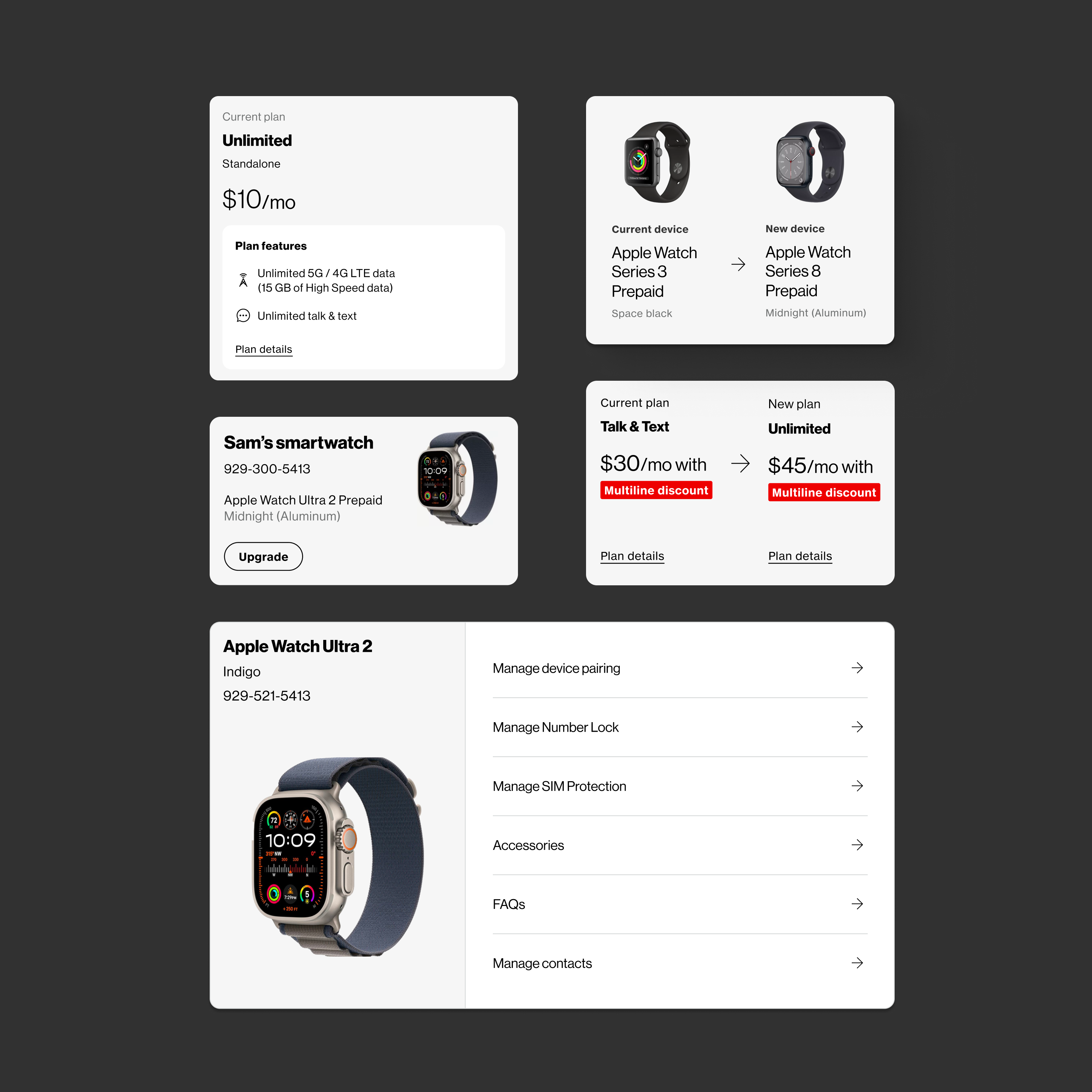
Phase 3
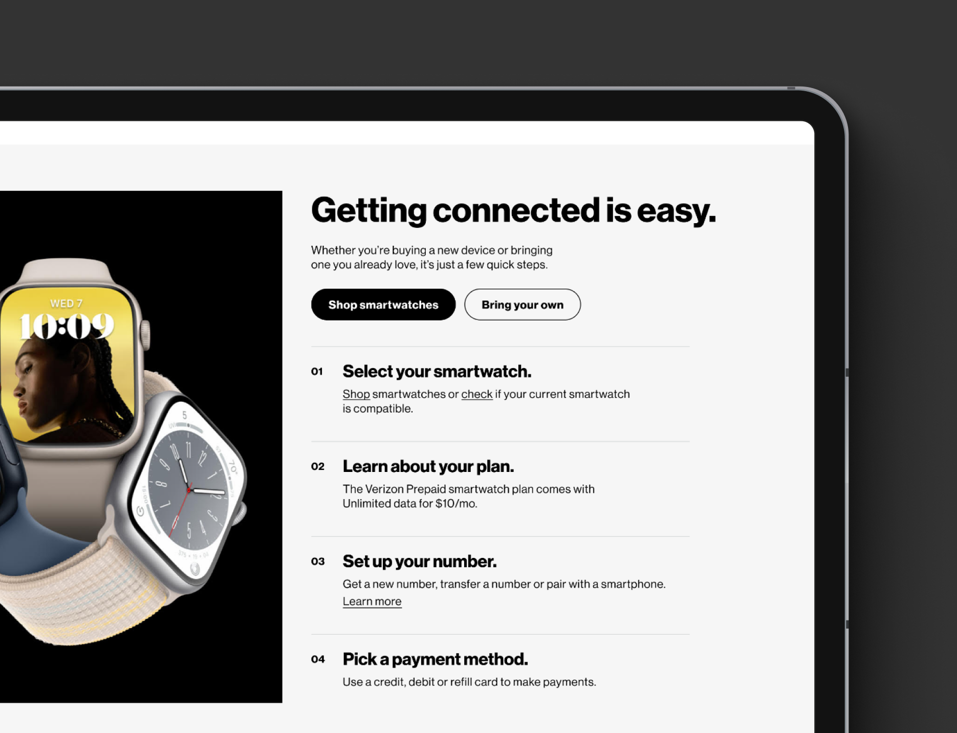
In this phase, we designed and implemented new self-serve capabilities to empower users to manage their smartwatch plans and devices connected to the Verizon network. Our approach accounted for the diverse types of Verizon users, smartwatch compatibility challenges, and the variety of available smartwatch plans. By optimizing user flows and creating seamless experiences, we enabled users to manage their wearable devices independently, reducing the need for customer support.
The following user flows were impacted during this phase:
- Self-Serve Entry Points
New entry points were introduced across the Verizon app and desktop experience, making it easier for users to access smartwatch management features. - Change Number Flow
Users can now update their device number effortlessly, whether by generating a new number or transferring an existing number from their current carrier to use with their Verizon device. - Upgrade/Change Device Flow
This feature allows users to upgrade their smartwatch by purchasing a new device from the Verizon store or replacing it with a compatible device they already own. - Manage Devices Flow
Users can now remove a smartwatch line from their family account or transfer its ownership to another account directly through the self-serve interface. - Add a Line/Merge Flow
This functionality enables users to seamlessly add a new smartwatch line to their Verizon Family account.


Lessons learned
- Breaking down the project into phases based on impacted platforms and user flows proved invaluable. It not only enabled us to prioritize development effectively but also offered flexibility to adapt to unexpected challenges without derailing the entire project.
- Working with limited development resources pushed the team to find innovative solutions within existing design components. It highlighted the importance of reusability and iteratively improving our design systems, demonstrating that resource constraints can fuel creative problem-solving.
- I learned to navigate multiple stakeholders overseeing different user flows and screens. Going through various clearance rounds, I learned to adapt my presentation style to effectively communicate design ideas tailored to each audience.