Verizon Visa® Card
Overview
The Milestones experience for Verizon introduces a captivating gamified experience tailored specifically for Verizon Visa® Card (VVC) holders. The VVC dashboard empowers users to utilize their cashback (Verizon dollars) on a wide array of Verizon products and services. However, a significant number of cardholders were unaware of the card's core earning categories and the diverse redemption options available. Thus, the imperative arose to develop the "Milestones" experience, aimed at motivating users to engage consistently with the app, particularly for cashback spending, while also fostering digital interaction through companion applications.

My role
- User research, audit, testing and wireframing
- Developing visual design system and prototyping
- Motion design and creating JSON/Lottie file
- Co-ordinating with developers and PMs
- Pitching designs and explorations to stakeholders
Design Team (AKQA)
Arjun Kumar (me) – Product Designer + Motion Lead
Diz Cohrs – Associate Copy Director
May Cheng – Associate UX Director
Arjun Kumar (me) – Product Designer + Motion Lead
Diz Cohrs – Associate Copy Director
May Cheng – Associate UX Director

Challenge
- To cultivate user loyalty by encouraging frequent app returns for cashback utilization (Verizon dollars) within in-app purchases.
- Devising non-monetary incentives to drive repeat engagement among users.
- Educating cardholders about the various core earning categories of the Verizon Visa Card was essential.
- To transform the interaction process with the VVC dashboard into an enjoyable and exciting experience.
Proposed Solution
- Proposed implementing a gamified experience directly within the VVC dashboard to heighten user engagement.
- The introduction of micro and celebratory animations as non-monetary rewards aimed to evoke a sense of accomplishment as users completed tasks.
- To address the need for education, an onboarding experience was designed to inform new VVC holders about the plethora of actions they could undertake within the dashboard.

User research process
— findings & insights
From clarifying goals to the synthesis of qualitative and quantitative data, this journey offers a comprehensive understanding of how user insights steered the course of our design process.
— findings & insights
From clarifying goals to the synthesis of qualitative and quantitative data, this journey offers a comprehensive understanding of how user insights steered the course of our design process.
1. Clarifying our goals
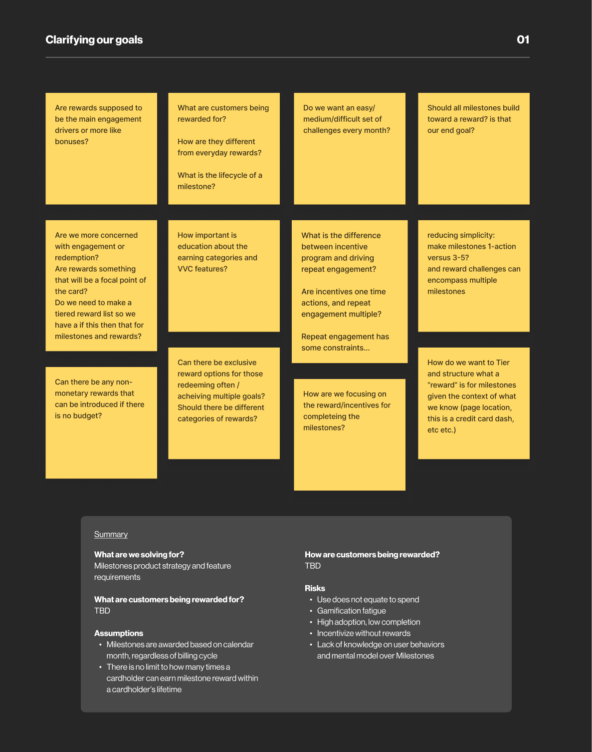
We began with an in-depth exploration of the project brief during our collaborative brainstorming session. Leveraging Figma, we utilized sticky notes to meticulously document all inquiries and considerations. Subsequently, we synthesized these notes, transforming them into hypotheses, client queries, and areas of interest. This process allowed us to gain a comprehensive understanding of potential challenges and opportunities.
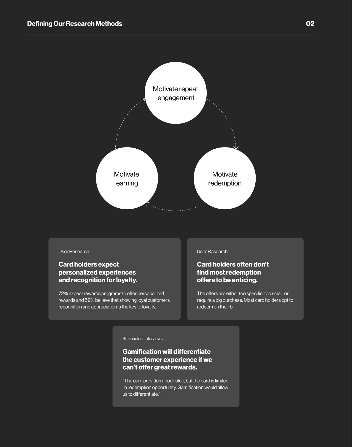
2. Defining Our Research Methods
With our goals and user questions established, we pursued a dual research approach—qualitative and quantitative analyses involving our app data and Verizon user insights.
Recognizing the significance of aligning our efforts with the broader business context, we engaged in a collaborative working session with Verizon's business leaders. This proved instrumental in addressing potential roadblocks arising from financial and technical constraints imposed by our clients. The workshop not only clarified project limitations but also reaffirmed the overarching business goals we aimed to achieve.
3. Diving into Discovery & Exploration
With our goals set and research methods defined, we delved into the discovery phase. Here, we leveraged the insights gleaned from our research to shape preliminary development ideas, design sketches, and wireframes. Two distinct approaches emerged during this phase: one featuring interstitial/intermediate rewards, and the other opting for a seamless, no-interstitial approach.

Defining the Milestone experience
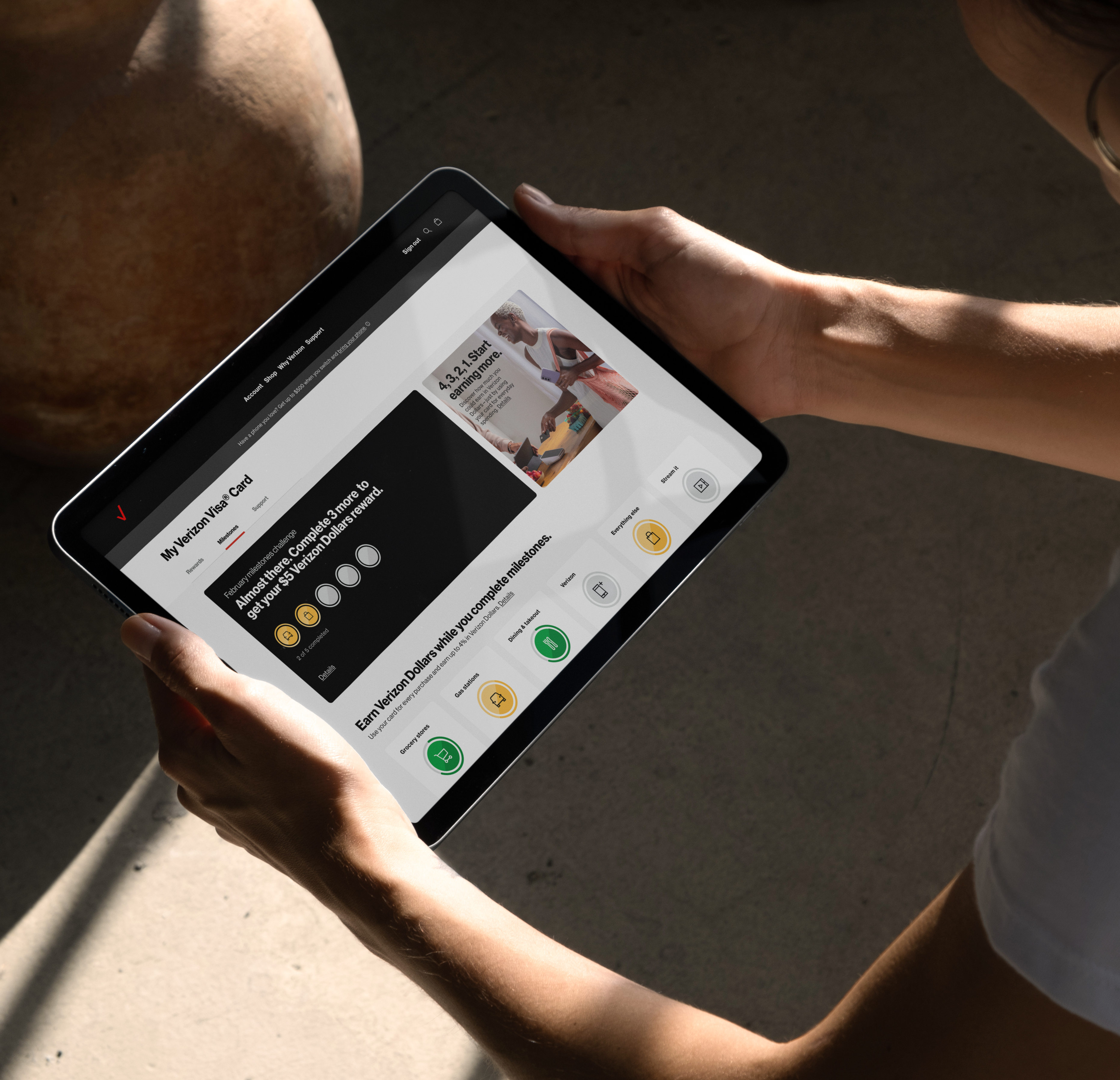
After leveraging the insights from our research phase and presenting various options to our clients we settled on a UX approach for the this experience. Each month, Verizon cardholders are presented with engaging tasks known as "milestones" as part of the monthly challenge. Successfully completing these milestones unlocks a valuable reward of $5 in Verizon Dollars, which can be conveniently redeemed within the extensive Verizon ecosystem.
To achieve a milestone, cardholders must utilize their Verizon Visa Card to make purchases across various earning categories. These categories offer enticing cashback rates of 4%, 3%, 2%, and 1%. By accomplishing these milestones, users become familiar with the distinct benefits and core earning categories of the Verizon Visa Card, encouraging them to actively increase their spending. It becomes a win-win situation where users gain rewards for their purchases, while simultaneously gaining a deeper understanding of the card's benefits.
Launch and Engagement Strategy
We also worked on a comprehensive launch and engagement strategy aims to seamlessly integrate cardholders into the Milestones program and sustain high engagement levels over time.
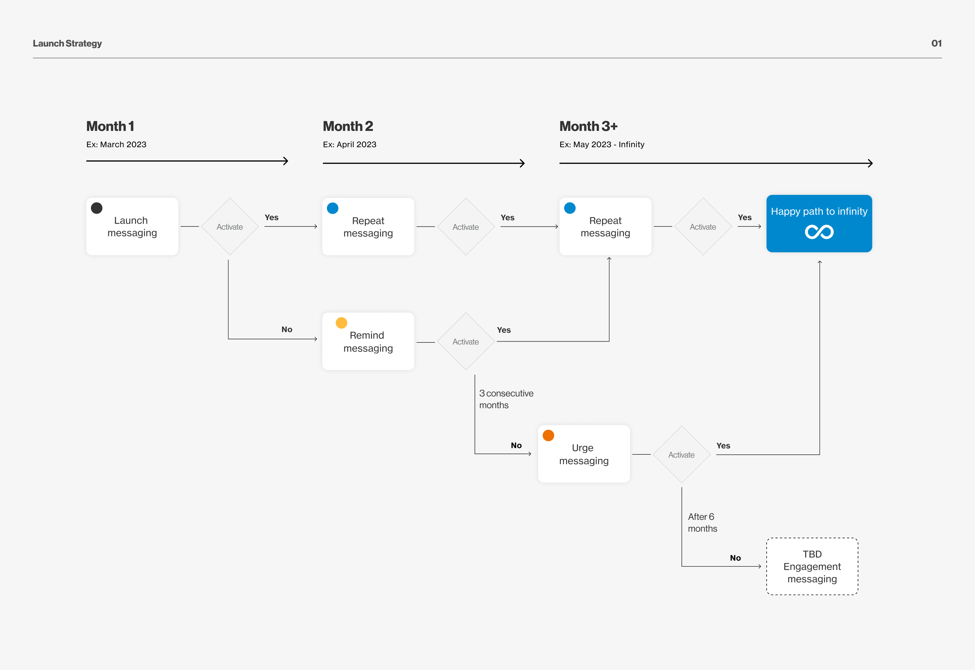
Upon launch, cardholders are seamlessly enrolled in the Milestones program. Our strategy involves leveraging existing modules to notify users of this auto-enrollment. This could include a launch email, in-app notifications, a milestone module card, or an onboarding modal.
Further, we recommended to:
- Initiate initial messaging for program launch and/or new cardholders to ensure a strong start.
- Tailor messaging for monthly engagement based on activation status, ensuring personalized and relevant communication.
- After 6 months, evaluate messaging for users who show inactivity in the Milestones program, strategizing on re-engagement efforts.

In order to keep the users engaged we recommended to use the Milestones hero banner via the VVC Dashboard to amplify awareness. As cardholders earn milestones or complete challenges, notifications will be strategically employed to communicate their achievements.
Other recommendations were:
- Send a program launch email to all VVC cardholders regarding auto enrollment.
- Implement in-app/push notifications for My Verizon App (MVA) users.
- Upon the first challenge completion, send a congratulatory email and implement corresponding in-app/push notifications for MVA users.
Wireframes
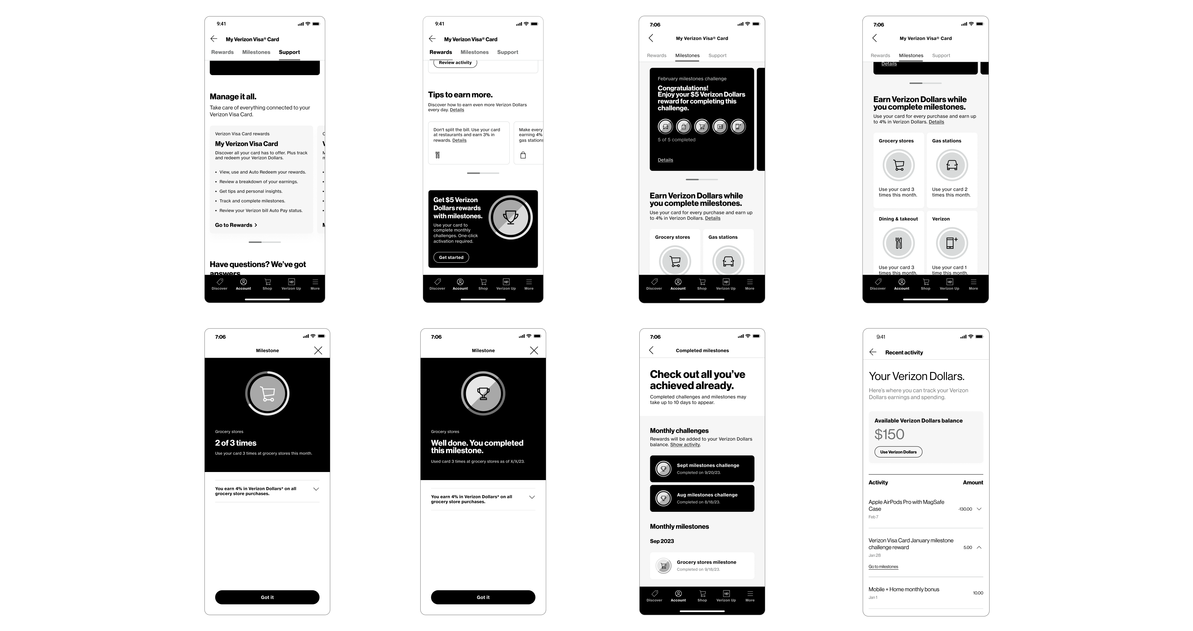
Visual Design
While Verizon did launch a new visual design system, significant parts of its digital experience still relied on elements from its older system. The Verizon Visa Card's dashboard found itself caught in this transitional phase, utilizing elements from both the old and new design systems. Consequently, we carefully selected components from both systems to create a visually cohesive and consistent design that aligned with other existing user flows.
Furthermore, we took the opportunity to expand upon the design system, pushing Verizon's boundaries to develop a visual aesthetic that not only functions effectively but also delivers an enjoyable interactive experience. Leveraging the core elements of the existing UI, we extended the library by introducing gradients, motion, and tiles.

Design Iterations
Once the Milestones experience was conceptualized, our focus shifted towards the design language of its landing screen. Through various iterations, the following four design iterations played a major pivotal role in shaping our final vision.
Iteration 1:
In the first iteration, we introduced a horizontal progress bar for each milestone, providing a visual representation of the user's progress. Milestone categories were organized using carousel components, accompanied by informative content at the top to guide users through the page and highlight their progress.
In the first iteration, we introduced a horizontal progress bar for each milestone, providing a visual representation of the user's progress. Milestone categories were organized using carousel components, accompanied by informative content at the top to guide users through the page and highlight their progress.
Iteration 2:
In the next iteration, we streamlined information, introducing an overarching progress bar for rewards. Circular progress bars represented milestones, with a check mark indicating completion. The carousel component was replaced with stacked tiles, eliminating the need for scrolling.
In the next iteration, we streamlined information, introducing an overarching progress bar for rewards. Circular progress bars represented milestones, with a check mark indicating completion. The carousel component was replaced with stacked tiles, eliminating the need for scrolling.
Iteration 3:
Here, the horizontal progress bar evolved into a scalable badge system, accommodating future challenges and offering more details about completed milestones. The header design was simplified with a tile, seamlessly merging with milestones under a cohesive black background.
Here, the horizontal progress bar evolved into a scalable badge system, accommodating future challenges and offering more details about completed milestones. The header design was simplified with a tile, seamlessly merging with milestones under a cohesive black background.
Iteration 4:
Completed milestones took on a golden hue, symbolizing achievement. We further simplified the design by removing categories and presenting all milestones together. A light grey background replaced black to maintain visual consistency across the VVC dashboard screens.
Completed milestones took on a golden hue, symbolizing achievement. We further simplified the design by removing categories and presenting all milestones together. A light grey background replaced black to maintain visual consistency across the VVC dashboard screens.


01
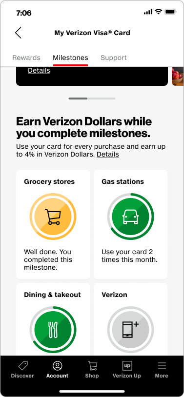
Milestones home screen
The milestone experience has its own tab in the VVC dashboard. This priorities the experience and gives the users easy access to it. The hero section on the top of the Milestone’s home screen educates the user about the experience while giving them a quick glance on their progress. Below the hero section the users can view all the milestones that they can work towards in a month. These milestones are based on the various earning categories available through the VVC with enticing cash back rates of 4%, 3%, 2%, and 1%.


02
Milestone modal
Clicking on any of the milestone UI card on the home screen opens up the modal. It provides details on how to complete the milestone and tracks progress through it’s dynamic badge. Further the modal also educates about earnings for the respective category and has info about the purchase disclosure, including link to Rewards and T&C page.

03
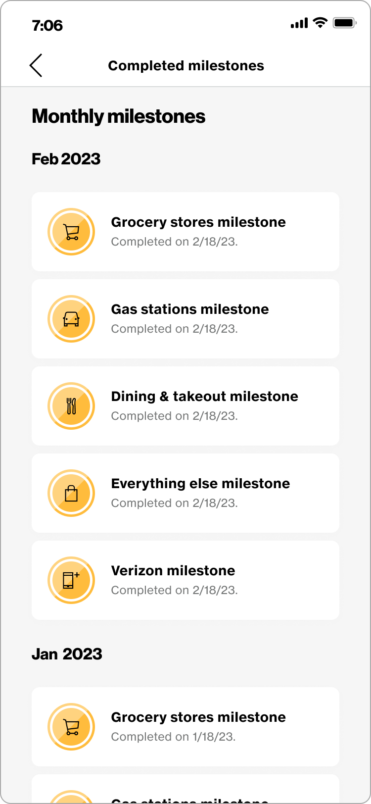
Completed milestones
This screen is the ledger that notes all the milestones completed by the user. It displays the completed milestones in chronological order.
Completed milestones
This screen is the ledger that notes all the milestones completed by the user. It displays the completed milestones in chronological order.

Lessons learned
- The project on implementing gamification techniques for customer engagement taught us valuable lessons about building stronger relationships with customers. We discovered that businesses can leverage gamification to cultivate customer loyalty and active engagement with their brand. By offering appealing rewards, exclusive content, or personalized experiences, companies can forge deeper connections with their customers, making the overall interaction more enjoyable and memorable.
- During the project, we initially assumed that a financial budget would be available from Verizon to implement monetary incentives for the gamified experience. However, we were met with the reality that such funding might not be feasible. In response, we learned to adapt and devise a strategy that could function effectively with or without monetary rewards. This lesson in adaptability prompted us to create a scalable approach for the gamified experience. Instead of solely relying on monetary incentives, we brainstormed and implemented non-monetary rewards that could provide a sense of accomplishment and gratification to the users. By incorporating celebratory micro-animations, exclusive access to content, or personalized interactions, we found alternative ways to enhance user engagement and satisfaction.